Espresso
Lattes & classics
Simple, familiar, and strong enough to carry the everyday traffic.
Built by Epic App Solutions. Names and details are placeholders.
A stripped-down, darker black-and-white demo focused on atmosphere, coffee, event rental, and a cleaner path to conversion.
This demo avoids long blocks of copy and lets the visitor understand the offer fast: espresso drinks, cold brew options, locally roasted coffee, and a setting people actually want to stay in.
A good coffee site should sell the feeling as much as the drink. This build leans into contrast, photography, whitespace, and short copy instead of decorative clutter.
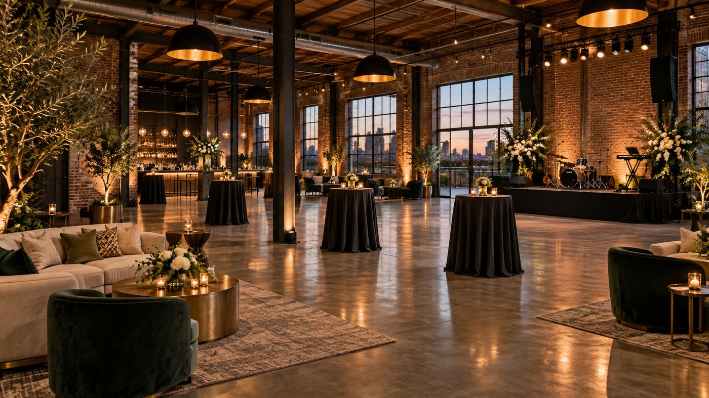
A better rental page should explain what the space is for, who it fits, what is included, and what the minimum spend looks like—without making people dig.
Seating, tables, patio access, bathrooms, and climate control are included. Outside food may be allowed. Insurance and a signed rental agreement can be listed clearly instead of buried in text.
Dark demo version. Clean, fast, and easier for visitors to understand at a glance.
Venue rental only. Beverage quantities and drink tabs vary.
This section gives visitors quick mental anchors—what kinds of events make sense in the space— without overwhelming the page.
Showers, birthdays, and casual private gatherings with an existing cozy layout.
Better than a conference room when you want people relaxed but focused.
Add self-serve or staffed drink service to keep the room feeling like an experience.
Workshops, clubs, signings, and low-key events that fit the tone of the space.
A stronger home page should always make the essentials obvious: what it is, when it is open, what it feels like, and how to book it.
Show the craft behind the cup, the barista at work, and the room your guests are actually renting.
Instead of ending on a static paragraph, this demo closes with a structured inquiry form designed to turn interest into an actual lead.
Not this one? Try these.
Browse all themes →The platform, not just the site
A website is step one. EAS wires it into the gear the business runs on.
Apps, micro boards, displays, CRM — matched to this kind of business:
Throwing a private event? Spice it up twice: our friends at Quiet Events rent glowing silent-disco headphones, and Scan Quest turns the whole place into a scavenger hunt — every install comes with 1,000 free Gems. Just go look.
9 times out of 10 that really means on phones, tappable, interactive. That’s a web app — installs straight from the browser, no store fees, no review queue, works on every phone. That’s what we build.
Tap either one — the honest two-minute answer first →